SEP 2026
GIGABOX
Turning an investor pitch into a shop window for Jodhpur.
- RETAIL
- QUICK COMMERCE
- ● LIVE
ROLE
Product & UX Design Intern
TIMELINE
15 weeks15 weeks · Jun–Sep 2026
TEAM
Product team + a developerProduct team, a developer, me
YEAR
2026
the context
Gigabox is two things at once: big category-only stores in Jodhpur — Kitchen and Sports today, Bags and Decor next — and an app that delivers from them in 60 minutes. By August 2026 it had served 24,178 customers across 45,085 orders. But “quick commerce” makes people think of grocery apps, and “store” makes them think of walking in. A brand that is both has to explain itself before it can sell anything.
the challenge
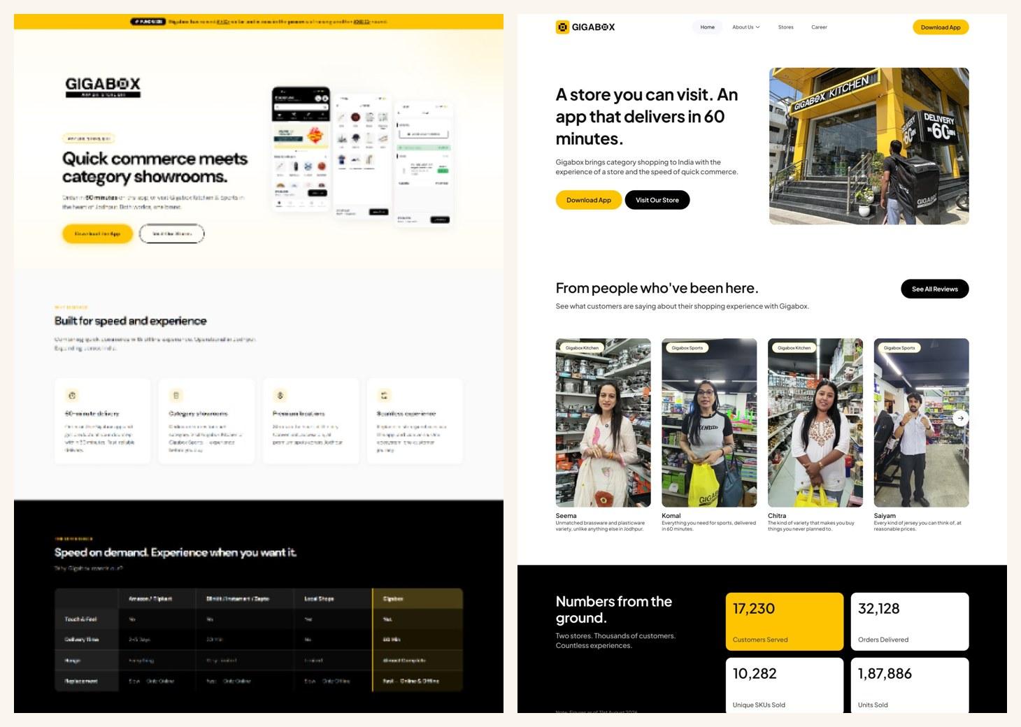
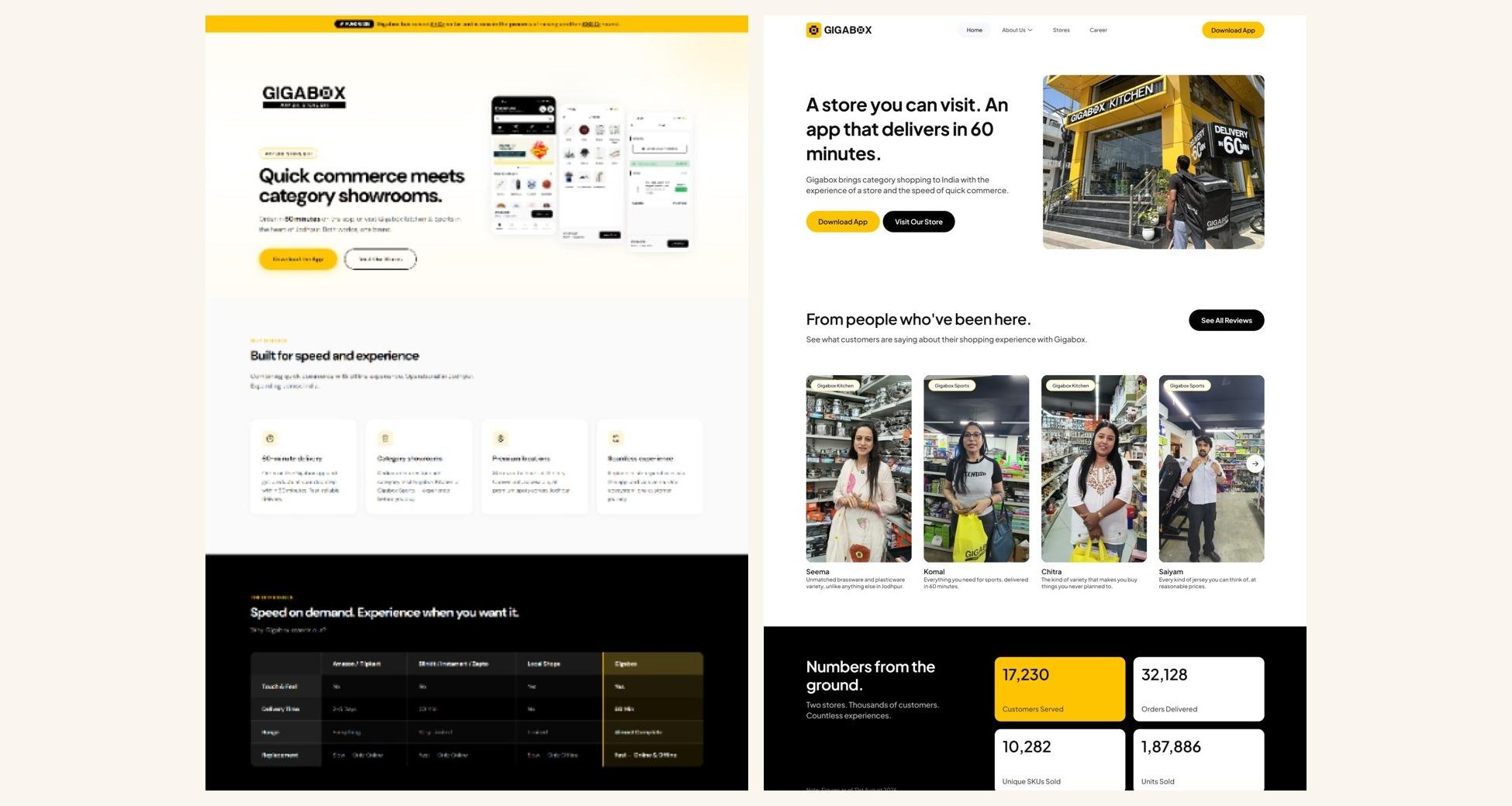
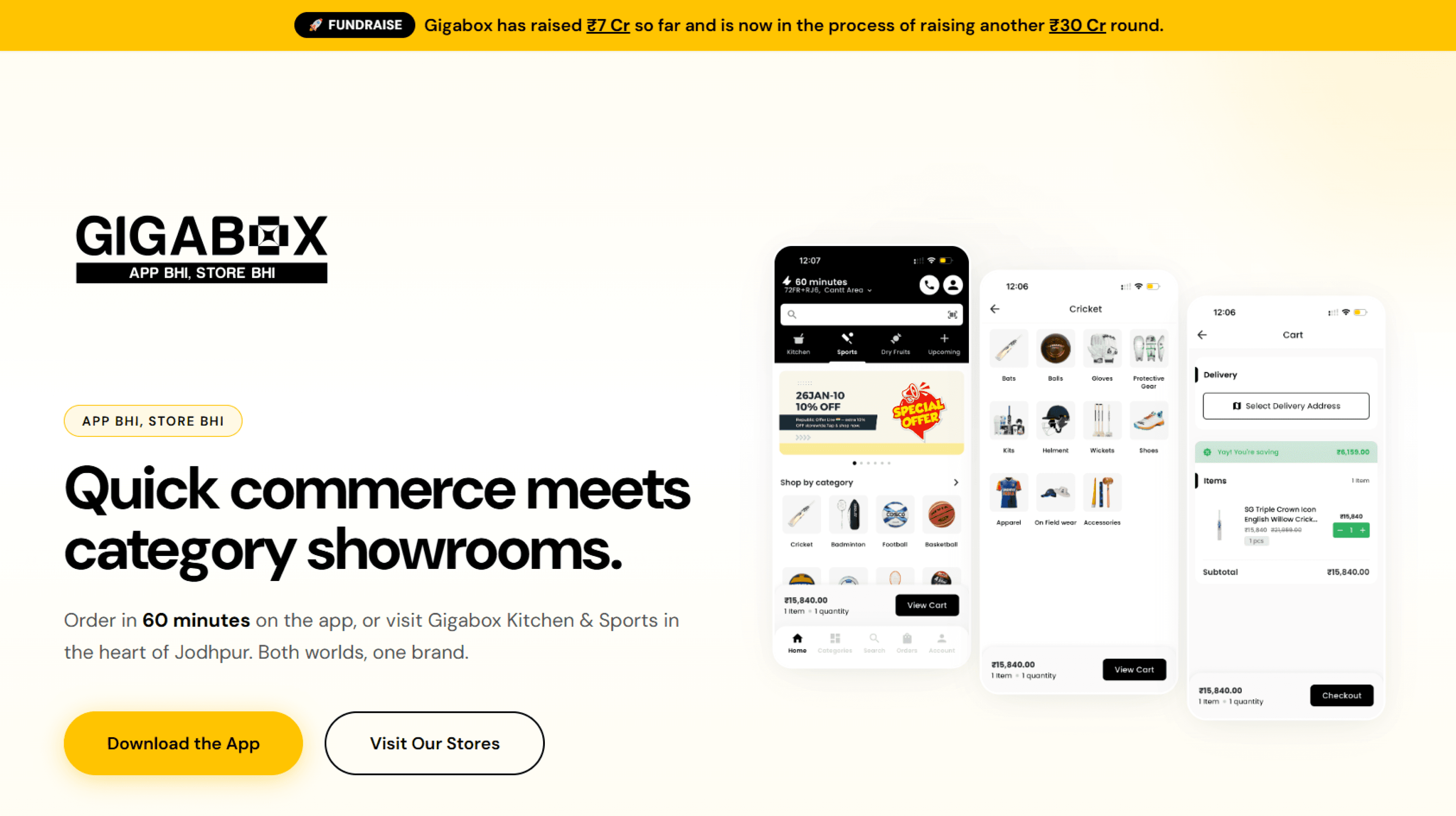
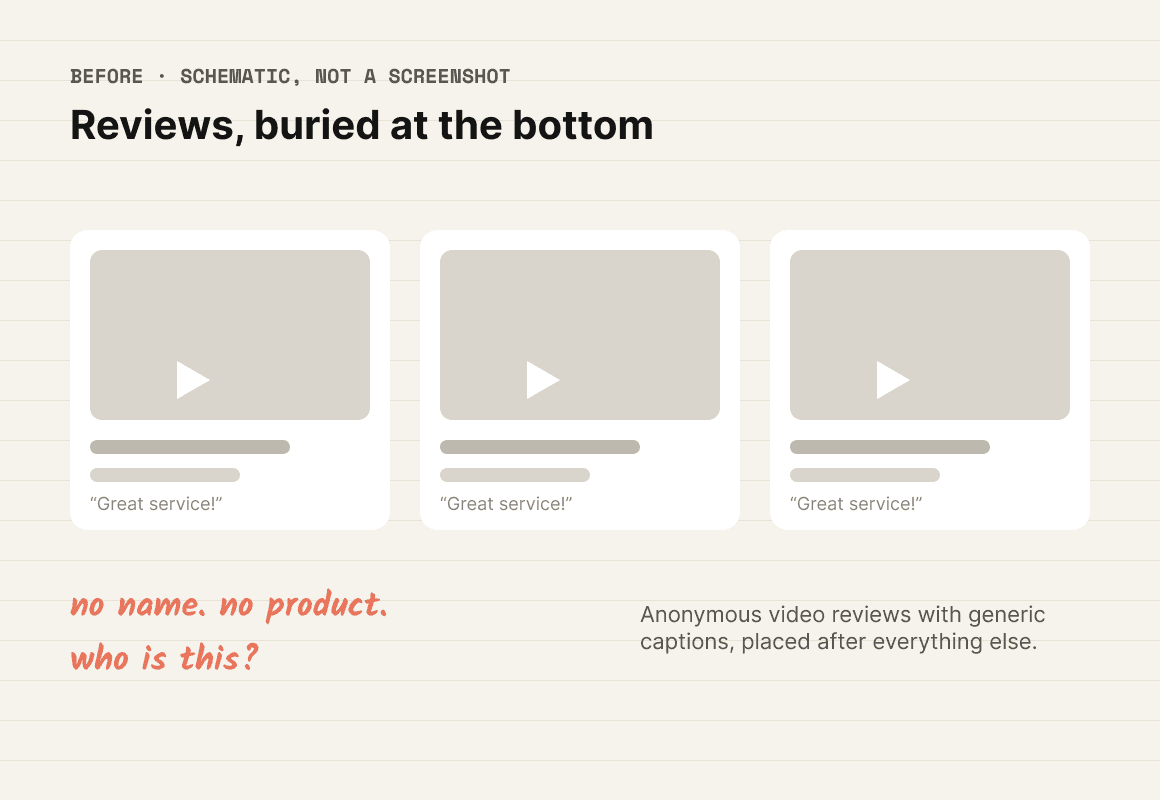
The old website spoke to investors, job seekers and shoppers on one long page. It opened with a ₹7 Cr fundraise banner, led with industry jargon (“quick commerce meets category showrooms”), rated competitors in a table nobody could check, and buried real customer reviews under 40 unedited store photos.
what I found
A shopper in a Tier-2 city won’t care how big the range is until they believe the shop is real. I called it certainty before variety — and Gigabox had the strongest certainty signal of all, a store you can walk into, hidden in the middle of the page.
STORE
A visible address and real photos are the strongest proof.
PAYMENT
Cash on delivery is preferred for a first order.
Where people check a shop before buying.
WORD OF MOUTH
Family and friends drive most first purchases.
what I changed
BEFORE
AFTER — MY REDESIGN
- Investors, job seekers and shoppers on one page
BEFORE: Investors, job seekers and shoppers on one page
A homepage for shoppers only — investors, suppliers and candidates get their own pages under “About us”
why: each visitor sees only what they came for
- “Quick commerce meets category showrooms”
BEFORE: “Quick commerce meets category showrooms”
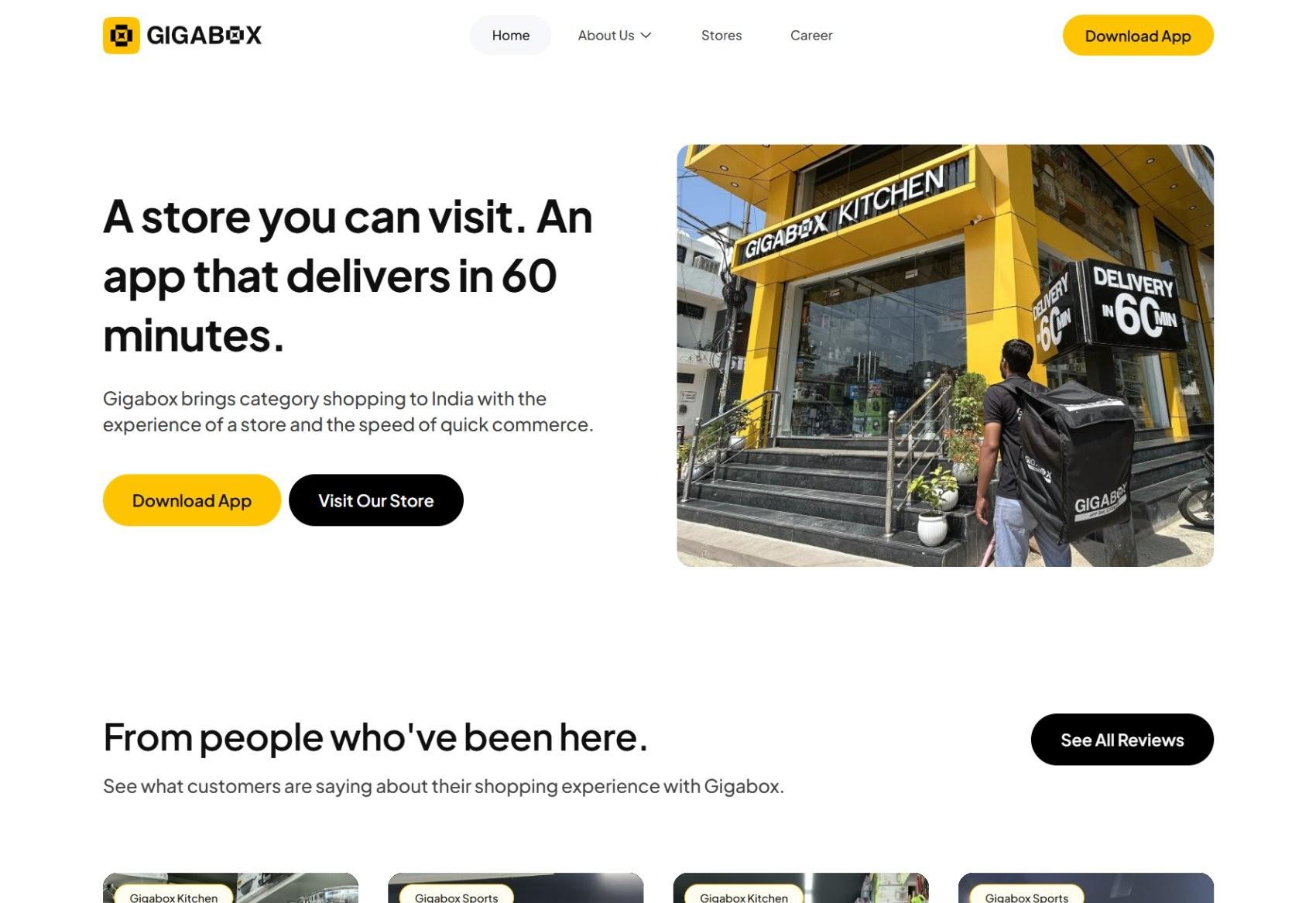
“A store you can visit. An app that delivers in 60 minutes.”
why: App Bhi, Store Bhi, in the shopper’s own words
- Reviews late, anonymous and generic
BEFORE: Reviews late, anonymous and generic
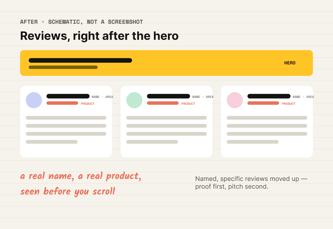
Named reviews straight after the hero, each with a specific line
why: proof before the pitch
- ₹7 Cr raised, ₹4 Cr sales
BEFORE: ₹7 Cr raised, ₹4 Cr sales
24,178 customers · 45,085 orders · 10,313 products sold
why: answers “do people like me buy here?”
- A table rating Amazon, Blinkit and Zepto
BEFORE: A table rating Amazon, Blinkit and Zepto
Four plain reasons: App Bhi Store Bhi, complete range, 60-minute delivery, easy returns
why: promises Gigabox can keep
- 40 raw store photos
BEFORE: 40 raw store photos
One photo per store, with its status and “View store”
why: curated proof; upcoming stores visible
the section order tells the story
OLD HOMEPAGE
- 1. Fundraise banner
- 2. Jargon headline
- 3. Four features
- 4. Competitor table
- 5. App screenshots
- 6. Stores · 40 photos
- 7. Reviews
- 8. Vision · roadmap · capital
- 9. Founders · offices · careers · FAQ
NEW HOMEPAGE
- 1. The promise: store + 60-min app
- 2. Customer reviews
- 3. Numbers from the ground
- 4. Stores, live and coming soon
- 5. Why Gigabox
- 6. The app
- 7. Founders’ note
- 8. FAQ + ask a question
then, the app
For the next phase I audited the live app with the same lens. I studied 36+ screens from 10 apps — Blinkit, Zepto, Instamart, Swiggy, Myntra, Nykaa and more — asking one question of every pattern: why did they make this choice? The biggest finding: the app’s strongest trust signal, its real stores, sat last in the scroll. I also rejected price-comparison badges, because claims a shop can’t verify undercut a brand built on trust.
14 → 8
HOMEPAGE SECTIONS
3
AUDIENCES, EACH WITH ITS OWN PAGE
36+
APP SCREENS DECODED
what I learned
Audit what’s live before redesigning it — half my “new” app ideas already existed; the problem was placement. Ask “why did they do this?” before “should we copy this?”. And one insight can carry two products: certainty before variety shaped the website’s order, then exposed the app’s biggest flaw.
see it live
The redesign is on preview now and replaces the old site soon. Compare them yourself.
the challenge
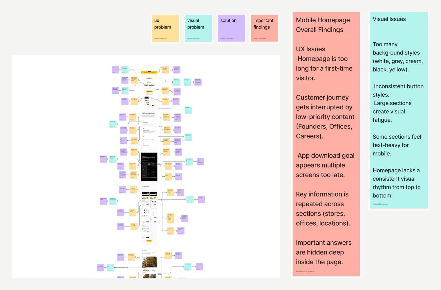
The homepage slowly stopped talking to customers. Halfway down it was about founders, offices and careers, while the app download, the one thing the business needed, came too late and too often.

what the audit found
I annotated every section of the old homepage, on desktop and mobile, with colour-coded notes: UX problem, visual problem, fix, key finding.
what I changed
BEFORE
AFTER — MY REDESIGN
- Three audiences, one page
BEFORE: Three audiences, one page
A homepage for shoppers only
- Jargon headline
BEFORE: Jargon headline
“A store you can visit. An app that delivers in 60 minutes.”
- Anonymous reviews, late
BEFORE: Anonymous reviews, late
Named reviews right after the hero
the result
14 → 8
HOMEPAGE SECTIONS
36+
APP SCREENS DECODED
what I found
A shopper in a Tier-2 city won’t care how big the range is until they believe the shop is real. I called it certainty before variety — and Gigabox had the strongest certainty signal of all, a store you can walk into, hidden in the middle of the page.
STORE
A visible address and real photos are the strongest proof.
PAYMENT
Cash on delivery is preferred for a first order.
Where people check a shop before buying.
WORD OF MOUTH
Family and friends drive most first purchases.
the section order tells the story
OLD HOMEPAGE
- 1. Fundraise banner
- 2. Jargon headline
- 3. Four features
- 4. Competitor table
- 5. App screenshots
- 6. Stores · 40 photos
- 7. Reviews
- 8. Vision · roadmap · capital
- 9. Founders · offices · careers · FAQ
NEW HOMEPAGE
- 1. The promise: store + 60-min app
- 2. Customer reviews
- 3. Numbers from the ground
- 4. Stores, live and coming soon
- 5. Why Gigabox
- 6. The app
- 7. Founders’ note
- 8. FAQ + ask a question
then, the app
For the next phase I audited the live app with the same lens. I studied 36+ screens from 10 apps — Blinkit, Zepto, Instamart, Swiggy, Myntra, Nykaa and more — asking one question of every pattern: why did they make this choice? The biggest finding: the app’s strongest trust signal, its real stores, sat last in the scroll. I also rejected price-comparison badges, because claims a shop can’t verify undercut a brand built on trust.
what I learned
Audit what’s live before redesigning it — half my “new” app ideas already existed; the problem was placement. Ask “why did they do this?” before “should we copy this?”. And one insight can carry two products: certainty before variety shaped the website’s order, then exposed the app’s biggest flaw.
see it live
The redesign is on preview now and replaces the old site soon. Compare them yourself.